
This layout was inspired by the old MPAA pre-roll screens from the 70’s, though I recreated all the various elements based on their modern counterparts. It was also experimental for me. It was the first time I used water-based ink, screen printed on paper, and used a diazo photo emulsion.
Inspiration for the layout of this poster. See the article about re-creating the rating screen and its elements.
I coated the screen with two coats of the emulsion on each side of the screen. After some test exposures, it seemed like the emulsion was pretty thin and would need multiple coats.
Final screen exposures. I was able to retain fairly high detail after exposing and cleaning the screen.
The final exposure set up to print with red ink. I did a short run of 10 prints.
Before I cleaned the screen, some water dripped on it, and the red, water-based ink started to run like blood. The dim, yellow lighting from the spray booth illuminated the screen from behind. After splashing a little more water on the screen, I snapped a picture and turned it into an alternate poster design, as you can see below.
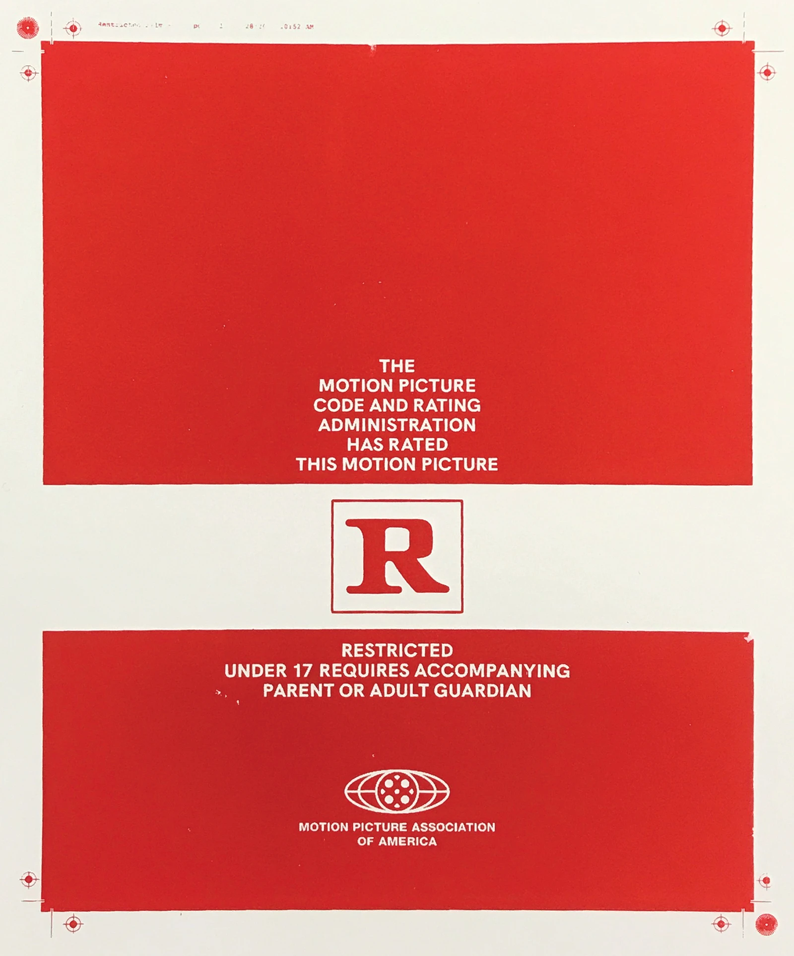
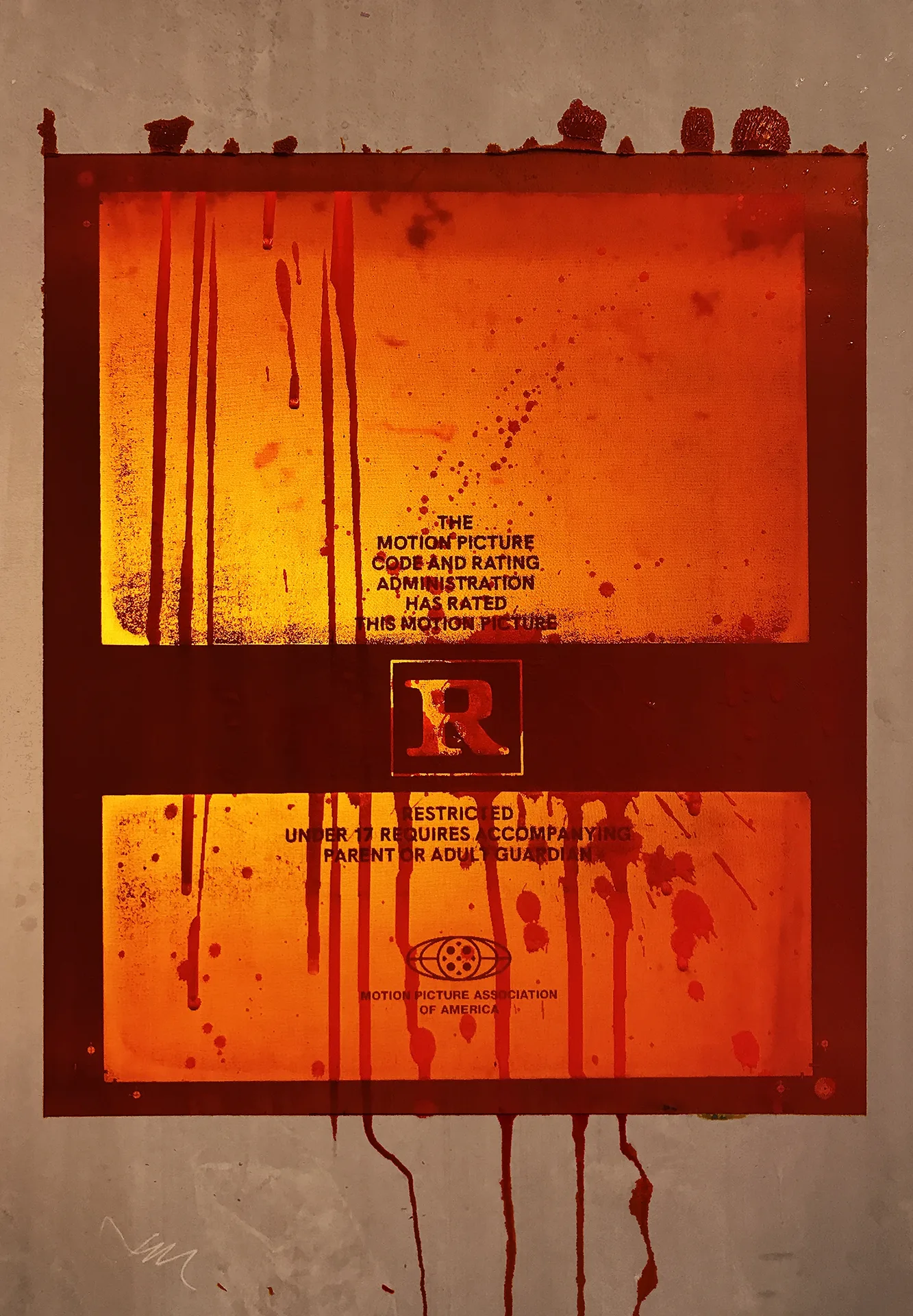
(First) The final printed poster. (Second) A stylized alternate poster design.