Overview
As a freelance graphic designer, I was tasked by the City of Mandan with creating engaging social media graphics to promote cycling in downtown Mandan following the installation of new city bike racks.
The objectives of the campaign were to:
- Bolster bike-riding culture and community pride
- Maintain a clean, simple aesthetic that would appeal to Mandan residents
- Feature a recognizable icon of the newly installed bike racks
The city team provided excellent collaboration throughout this project, and gave me significant creative freedom to develop the visual direction while meeting their specific needs.
Final Designs
Design Elements
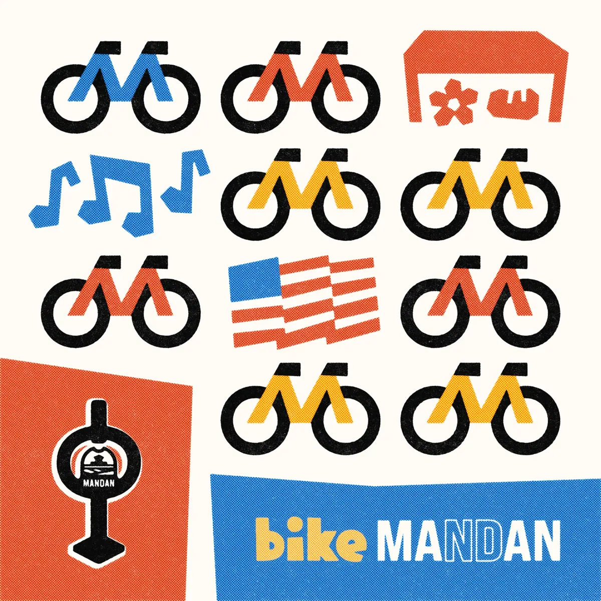
Bike Rack Icon
The physical bike racks installed downtown feature the City of Mandan logo centrally positioned. For the icon, I recreated the city's logo in vector format, then made slight modifications to ensure legibility at smaller sizes.
While slightly stylized to harmonize with the overall graphic aesthetic, the bike rack icon needed to remain recognizable to help residents identify the new infrastructure downtown.
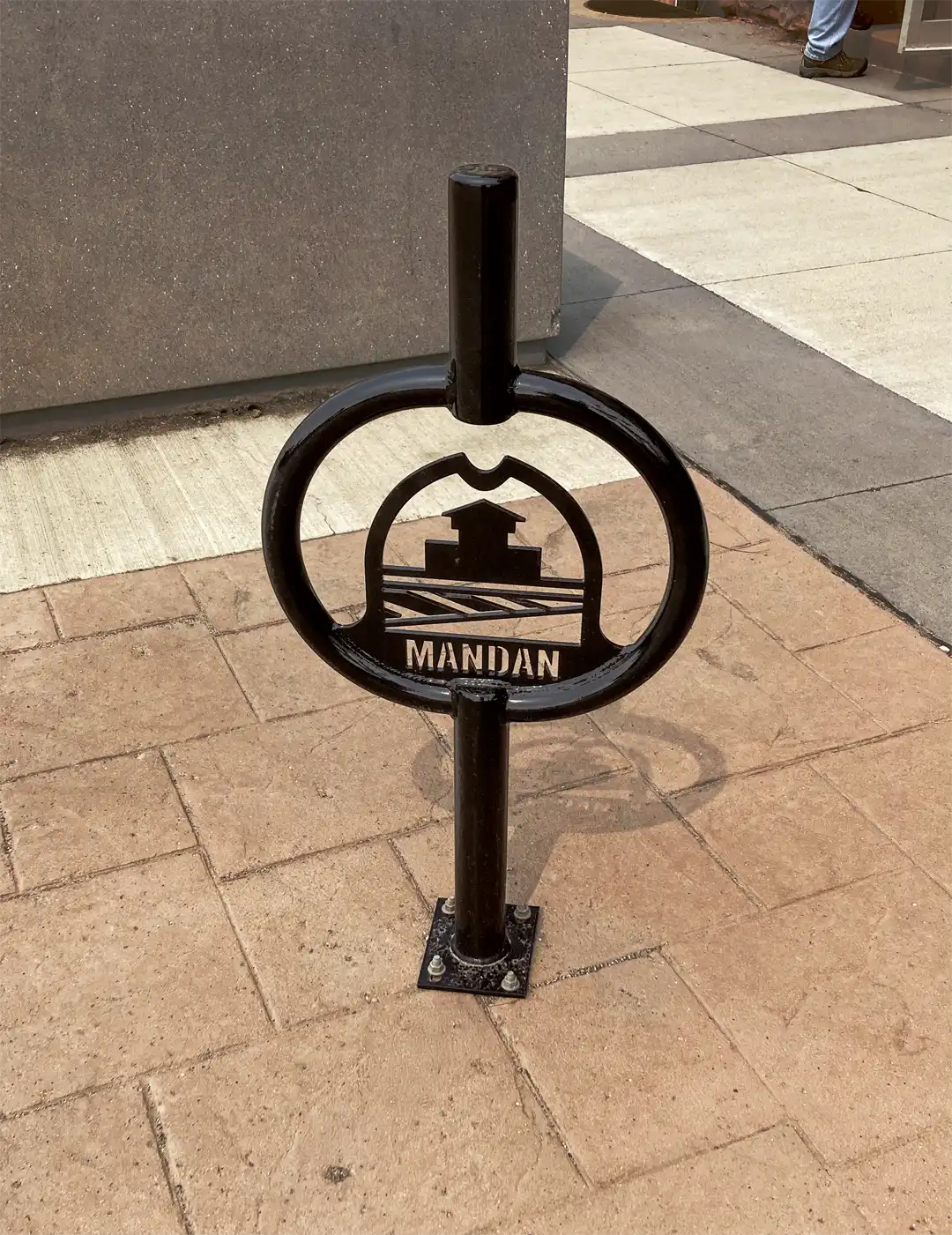
The actual bike rack and resulting icon.
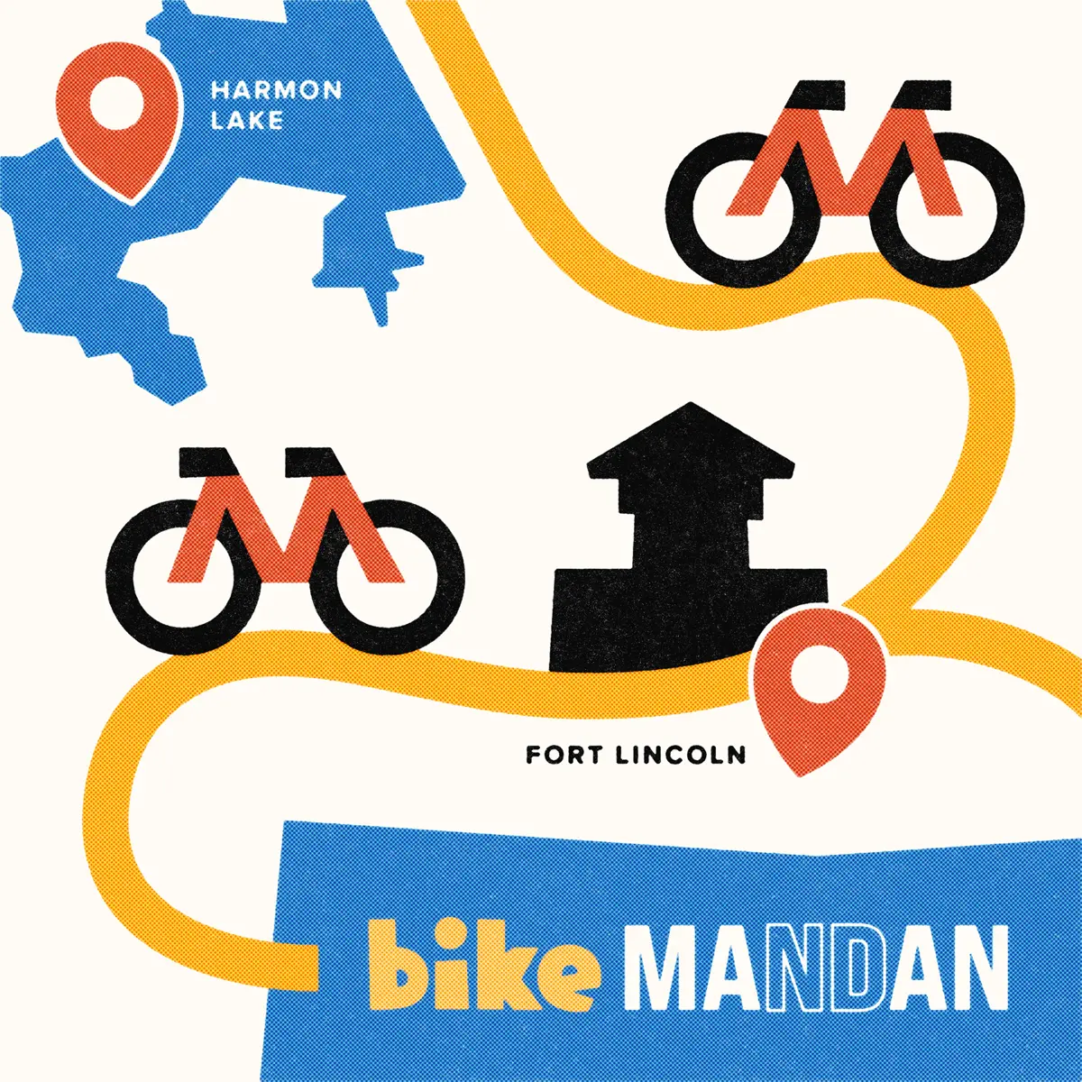
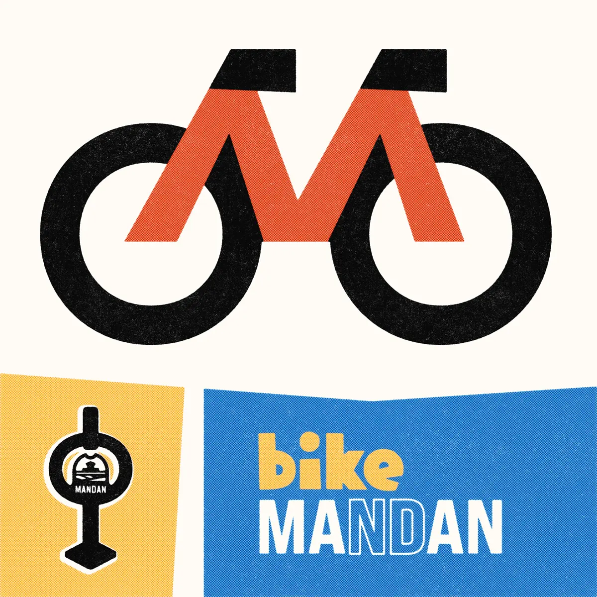
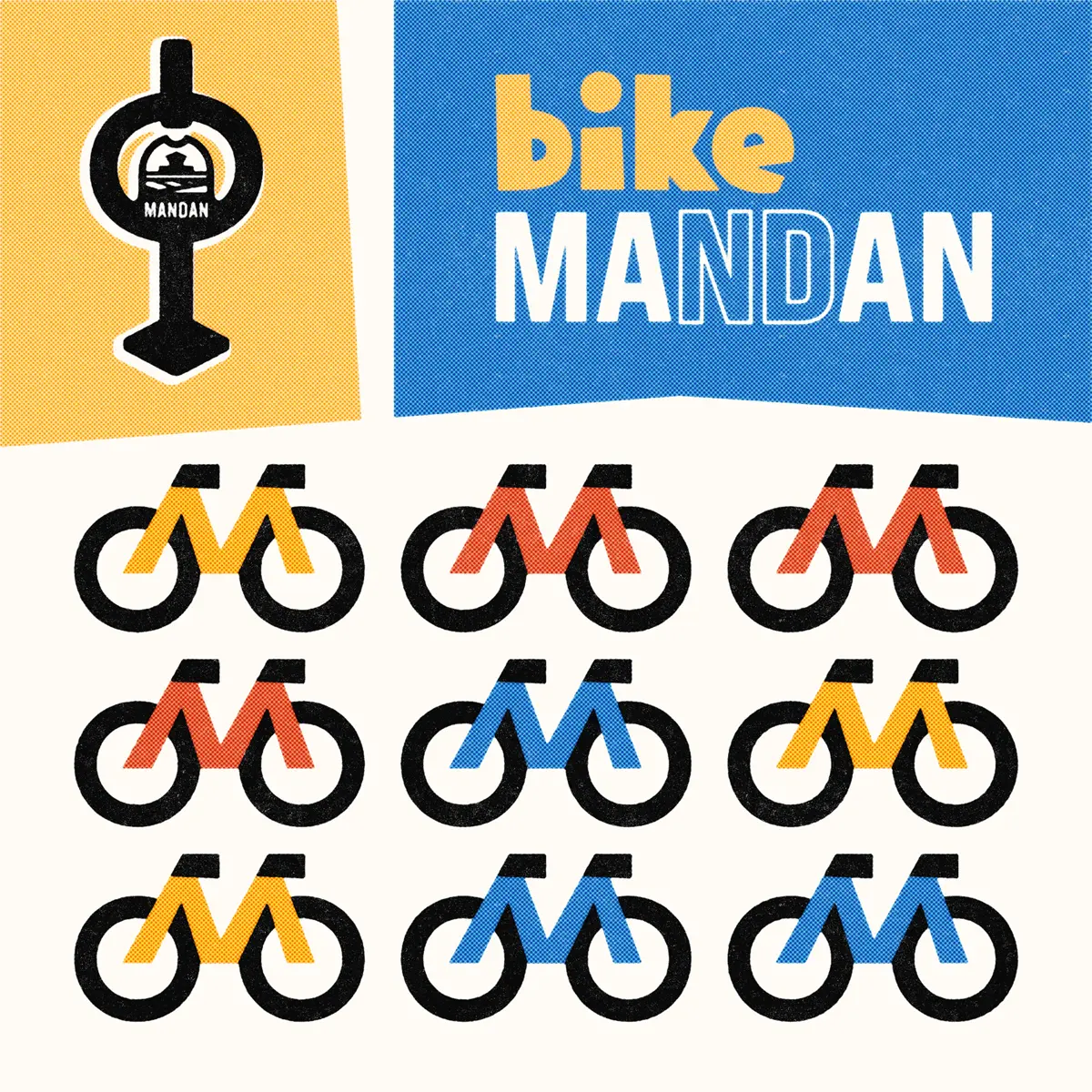
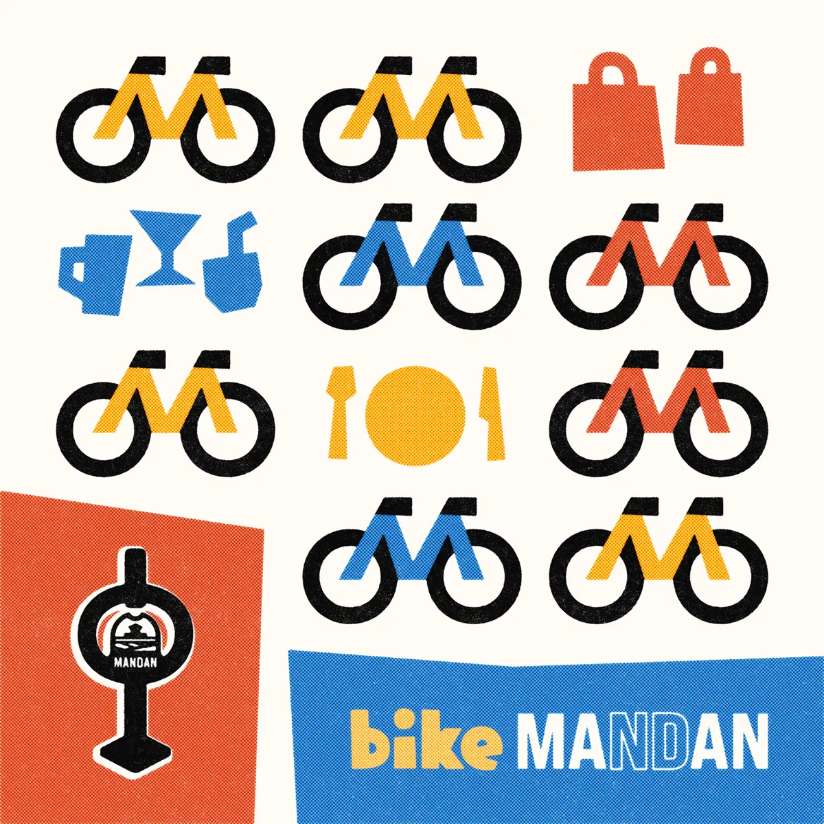
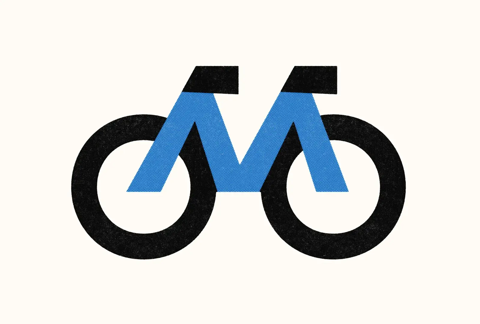
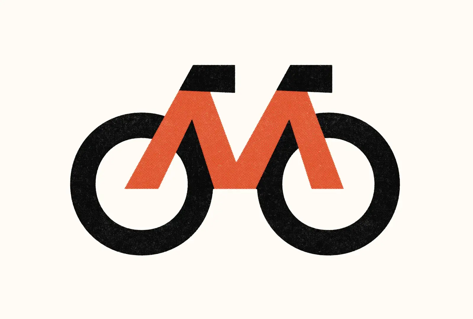
Signature Bike Icon
The centerpiece of the campaign is a modernist bike icon featuring subtly angled lines that create an approachable, active feeling. The colored frame of the bicycle intentionally forms an "M" shape, a nod to “Mandan” that adds local relevance.

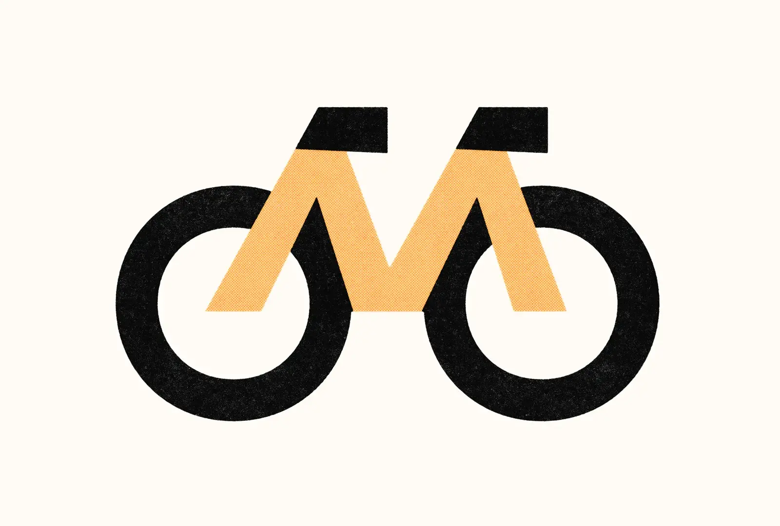
Though originally designed as a standalone graphic element, I think the M-shaped bike icon has the ability to work alongside the Bike Mandan wordmark as a full logo for a hypothetical Bike Mandan campaign, with some tweaks. This versatility comes from its simple modernist style and intentional design.
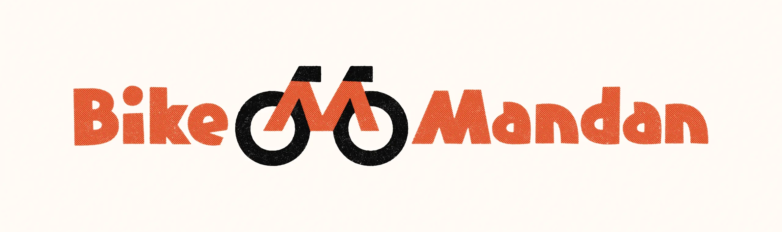
Speculative custom Bike Mandan wordmark paired with this project's Bike Icon. Done for fun after project completion.
Bike Mandan Wordmark
Although creating a formal logo like the example above wasn't part of the original project scope (due to time and budget constraints), I did develop a unifying wordmark to strengthen brand cohesion across the graphics. This wordmark combines "bike" lettering that matches the graphic style of the posts with the established "Mandan" wordmark from the city's existing logo.
"Hidden" deliverable: Vectorizing the City of Mandan logo.
Results
This project demonstrates how thoughtful design can support community initiatives. The social graphics help to raise awareness of the new bike racks while promoting cycling as an enjoyable, practical transportation option for downtown Mandan. The consistent visual language across all graphics helped establish a recognizable mini-campaign despite the project's limited scope.
Overall, I’m pleased with the project: The City of Mandan team was wonderful to work with, and I'm proud of the M-shaped bike icon that seamlessly combines the core ideas of the Bike Mandan initiative.