
Black Anatomy was a class project turned personal project where the goal was to create an entire brand from the ground up.
It started with a logo and grew to include stationery, a website, and a full digital and print advertising campaign.
I wanted to create an alternative cosmetics brand that empowers women to express themselves in any way they want to. This meant staying away from traditional, big-name cosmetic luxury styling. The direction for the brand was inspired by witchcraft and covens, drawing parallels to Salem, and the freedom the women were looking for by meeting up in the forest to dance at night.
Logo & Packaging
For the logo, I wanted to create a custom wordmark that looked dark and mysterious. The final logo accomplishes this while still having a professional quality that speaks to a fairly large demographic.
The logo started as a sans-serif typeface that I heavily modified and added serifs and curves to.
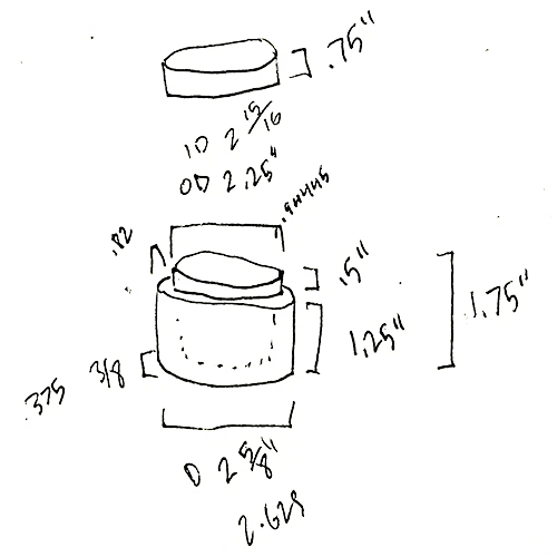
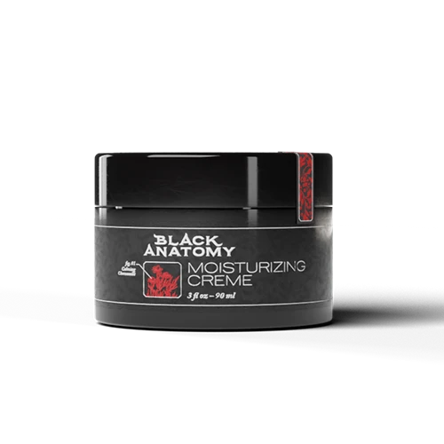
I created a 3D model of the container to mock-up my packaging.
Print Ad
The poster designs came from the concept of scientific dioramas that might be used in an anatomy class. The designs feature close ups of different microscopic parts of the body with a container of the brands moisturizer integrated into the scene.
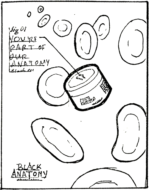
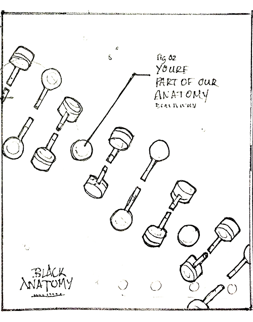
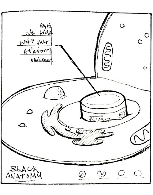
Original thumbnail concepts for the ad campaign designs.
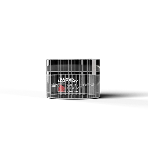
These scenes were designed on pen and paper as you see above, then recreated in a computer generated 3D environment to give me control over different lighting and material elements, and allowed me to render somewhat realistic scenes to fit the style and tone of the ad campaign.
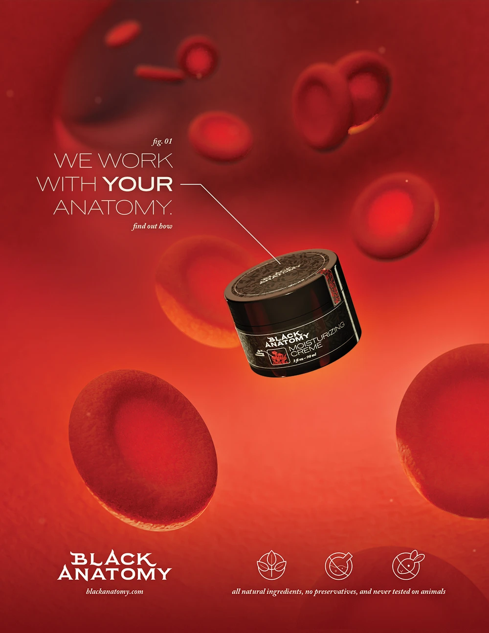
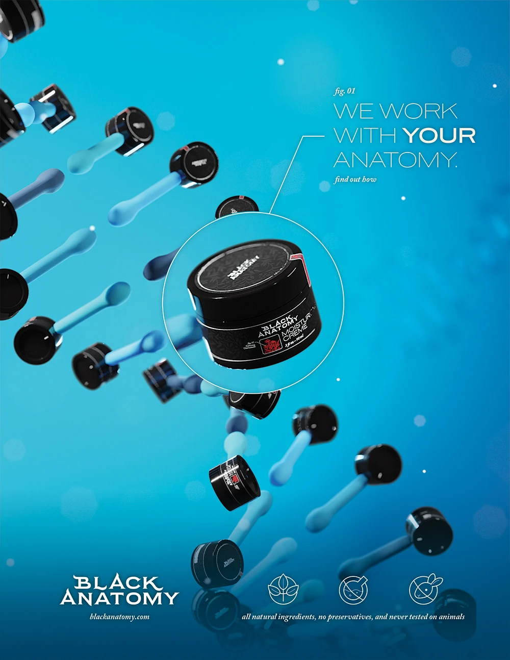
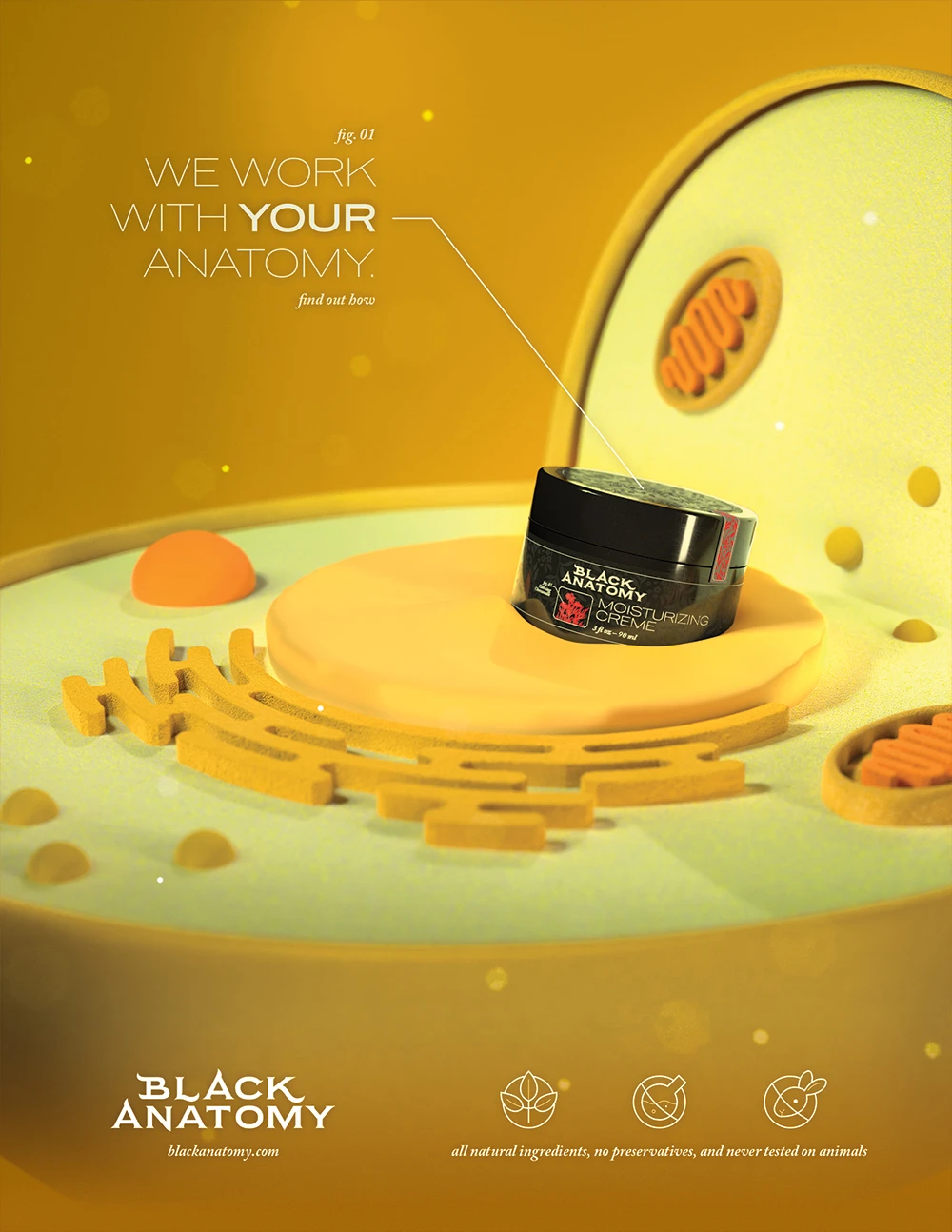
Final print ad campaign layouts.
All Elements
As featured below, I adapted the design of the print advertisements for use in mobile or website advertising. Informed by the design language of the logo, packaging, print and web ads, I created a brand guide. Having the guide really made designing the website to feature the brand's projects much easier.
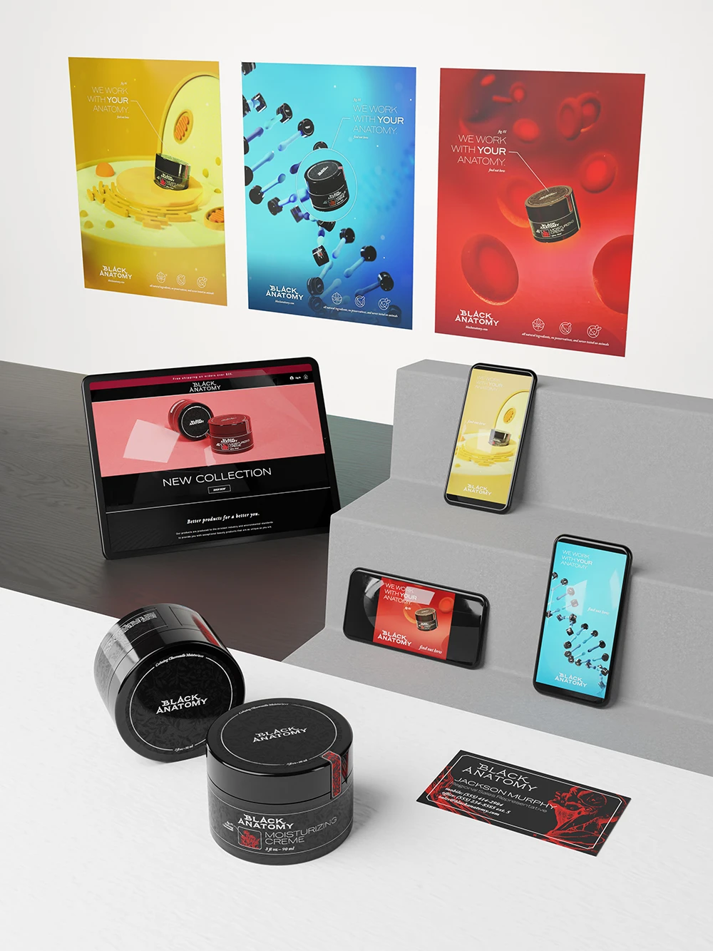
All branded elements shown in one scene.
Overall, I'm quite pleased with how everything in this project turned out. I really pushed myself to create the 3D rendered illustrations and I'm glad that I did. Seeing all of the brand's elements in one image is the perfect culmination of the project.