
The title of this article is a bit of a play on words; it references the movie trailer rating screen (seen above), as well as the physical screen I used to screen-print some 1-color posters (seen here).
As part of this post, I've made available some free assets (EPS, Photoshop, and Illustrator) that I created for this layout, so you can remix, mash-up, or create your own! Also included is a template for the standard trailer rating screen, in case you are making a spoof or parody and want to customize it.
Free Assets:
Sister Article:
Note: This article is for educational purposes. Using this rating screen in a non-parodical manner without having approval and an official rating from the MPAA is not advised, and could even get you into legal trouble. All copyrights and trademarks are property of their respective owners.
The Motion Picture Association's branding is inconsistent. The fonts, logos, and icons can all be found in different versions in different places, as recent as last year. I've been as exacting as possible putting together these elements, but it's difficult when there doesn't seem to be much consistency from the official source.
What is the MPA Rating System?
The system was developed by the Motion Picture Association of America in 1968 as a way for parents to make informed decisions about the type of media their children were consuming. These are the ratings you see (or used to see, before video streaming services) on the back of DVD cases and on posters. They are straightforward and can help give a sense of the content of a movie before you see it.
MPA Rating System:


All ages admitted. Nothing that would offend parents for viewing by children.


Some material may not be suitable for children. Parents urged to give "parental guidance". May contain some material parents might not like for their young children.


Some material may be inappropriate for children under 13. Parents are urged to be cautious. Some material may be inappropriate for pre-teenagers.


Under 17 requires accompanying parent or adult guardian. Contains some adult material. Parents are urged to learn more about the film before taking their young children with them.


No One 17 and Under Admitted. Clearly adult. Children are not admitted.
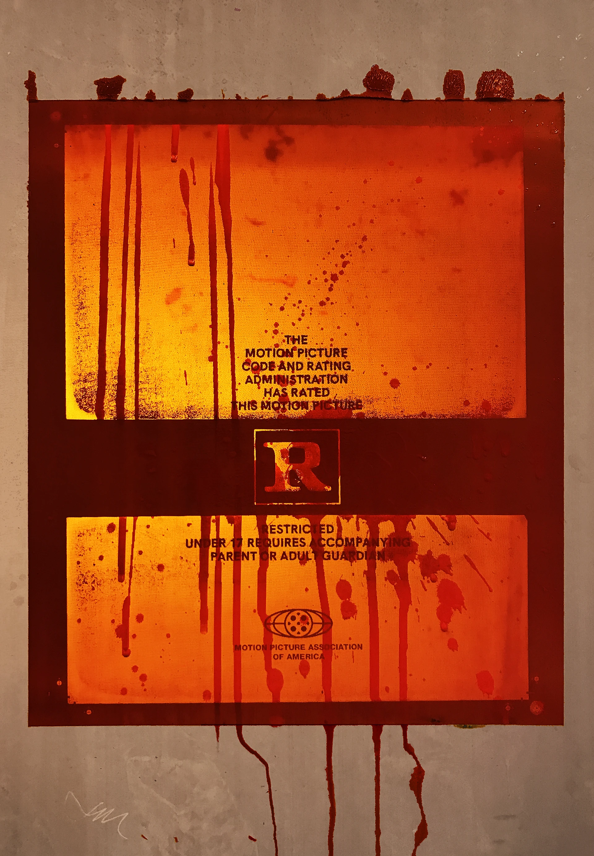
When I created the vector versions of these ratings you see above, I noticed how quirky the typography between the older ratings was. The "1's" are completely different between PG-13 and NC-17, the shape of the "C" and the "G's" don't seem to match, and the serifs on the "N" are formed differently from the other letters. These differences were all corrected at some point, as seen in the newer forms.


Detail of the letterform discrepancies between older and current forms.
I used an old, well-known poster as reference, so these aren't the most up-to-date versions of the letterforms, however, it is my opinion that these are more recognizable. I have also included the newest versions I could find online, which are more consistent. You can find these and all the elements referenced in this article here.
If you have any information on when/who updated these letterforms, please let me know.
Fun Fact - The MPA says movie trailers are to be no longer than two minutes thirty seconds, but the major movie studios get one exception per year.
What is the MPA Rating Screen?
The rating screen that is discussed in this article is what you see before a movie trailer plays. It shows the audience the who trailer is deemed appropriate for, and can either display the rating of the film featured or not.
There are two main movie rating screens that quickly, visually describe how the trailer is rated, green band and red band.
Green band trailers are most common and are what we are used to seeing before trailers. They display the text, "The following preview has been approved to accompany this feature." This wording has been used since 2013. Movies of any rating (including NC-17) can have a trailer cut together that is deemed appropriate for the intended audience.
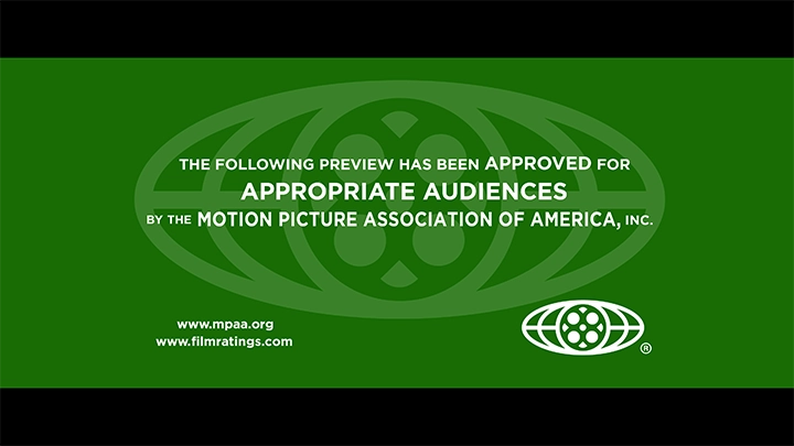
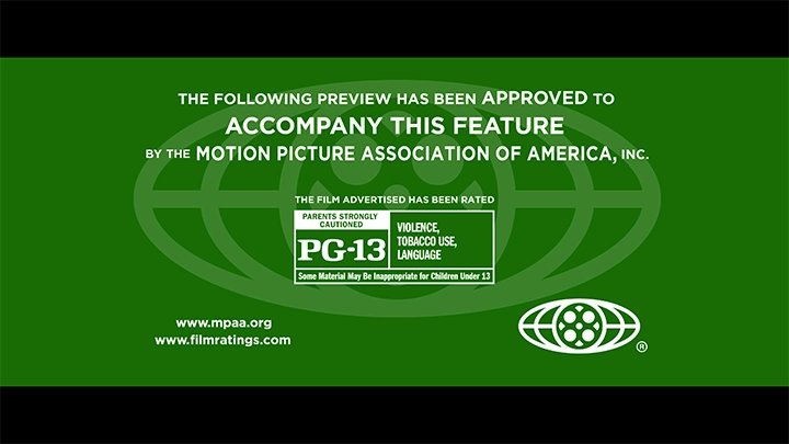
Variations of the "green band" trailer.
Red band trailers are more restricted, though, and may contain bad language, nudity, or other things not suited to general audiences. The text on red band trailers reads, "The following restricted preview has been approved for appropriate audiences." These trailers are generally only for movies that have an “R” or “NC-17” rating.
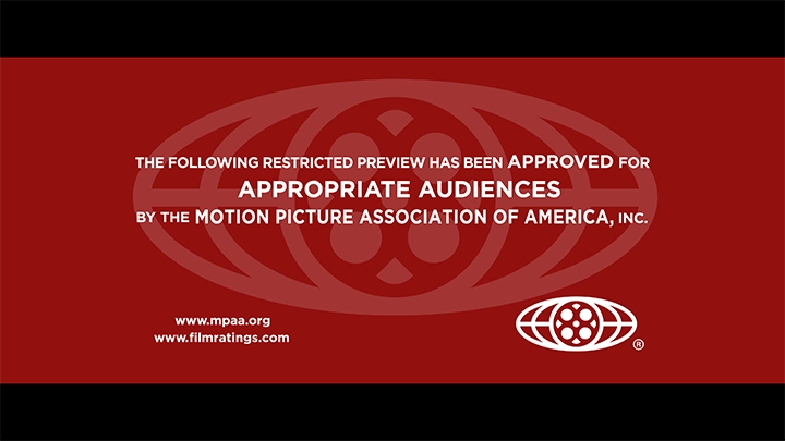
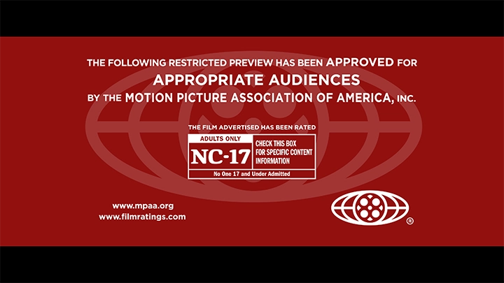
Variations of the "red band" trailer.
Yellow band trailers also exist, but they're not widely used. They are essentially red band trailers, but for the internet; they note that the trailer is approved for age-appropriate internet users. The background color doesn't work very well with the new (2018) design of the screen, which uses flat colors and no drop-shadow effects like the old design did. I have added a drop shadow on the text of the image below to increase readability, but yellow band trailers are mostly a novelty relic at this point.
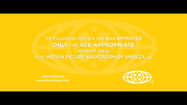
The internet-only "yellow band" trailer.
These layouts were created with my free "Definitive Movie Trailer Rating Screen Template."
MPA Logo
The MPA logo is very inconsistent. They recently dropped the last "A" and want to be known as the Motion Picture Association. This switch is poorly thought out though: their website is mpaa.org,* and they still use "MPAA" all over the place. There was some controversy online on design message boards when this logo was unveiled, as the kerning around the "P" seems to be a bit off.
* Note: Since publication of this article, mpaa.org now redirects to motionpictures.org.
The latest iteration of the MPA(A) logo.
I first became interested in this project probably sometime around 2018, when MPAA switched to this latest version of the trailer rating screen. The new, clean icon logo is featured at a large scale in the background of the screen.
Older version of the icon (left) that is still sometimes in use.
While researching this project I also found a weird animated logo featured on the MPAA Vimeo account. The logo uses the older layout with full text at the bottom and has split up the lines of the icon to (I'm assuming) give it depth. The film reel parts zooming in separately at the start break it up and confuse the form. The animated logo isn't that bad, it just adds too many elements that aren't present in the original logo. MPAA also uses the center circle portion of the icon as a favicon on their website, but I haven't noticed it anywhere else.


(left to right) Old logo layout, weird animated logo, icon used as favicon.
What are the Movie Rating Fonts?
The font used in the new MPA logo is a slightly modified Futura. The bowl of the "P" is elongated to bring it's width closer to that of the "M" and "A".
Franklin Gothic is used for the rating box (the actual ratings like "G", "PG" are custom as far as I can tell, but are included in the asset download pack). It is generally condensed, but the amount it is condensed varies depending on how much text is in a given space. To fit more text in the box, the type is more compressed.

The main font on the rating screen is Gotham. It is all the same weight, but varies in size. The words that are emphasized have changed over the years to better communicate the message, the first line changing from "the following preview has been approved to," to as you see below.

I've presented the design of all the different elements of the trailer rating screen and compiled what I believe to be the most comprehensive and accurate trailer rating screen template available online, for free. This has been part one of a two-part series of the digital assets and printed posters I created. The second part is just below, and there are links to the assets and some other resources at the bottom of this post.
Part II: The Screen Prints
I started creating these assets when I was designing a layout to screen print a poster. You can read my short write-up and see some photos of the process. Click here to read about my process printing these posters. Here are some of the results which are explored more deeply in that article. Thank you for reading.

Alternate poster design and screen printed poster I made.
Resources
Links from the Article
- The Definitive Movie Rating Screen Template
- MPA Rating Screen All Assets
- "What Everyone Should Know About the Movie Rating System" Poster
- Newer/Other MPAA Posters
Official Sources
Fonts
- Franklin Gothic by URW
- ITC Franklin Gothic - Adobe Fonts
- All Franklin Gothic - Adobe Fonts
- Gotham Font by Hoefler & Co.
- Great Article Featuring Many Free Gotham Alternatives
- Homepage-Baukasten - Gotham Alternative
- Futura on Linotype
- Futura PT - Adobe Fonts
Thanks for reading!
Older letterforms first, current forms second.